


Every driver knows this feeling:
Google Maps says “11 hours”… and then gives you one long blue line.
No sense of velocity.
No sense of progress.
No sense of where you’ll be after 1 hour, 3 hours, 7 hours.
Just… blue.
Google Maps solved navigation.
But it still hasn’t solved something more basic:
situational awareness while moving through time.
So here are two simple toggles that should already exist inside Google Maps.
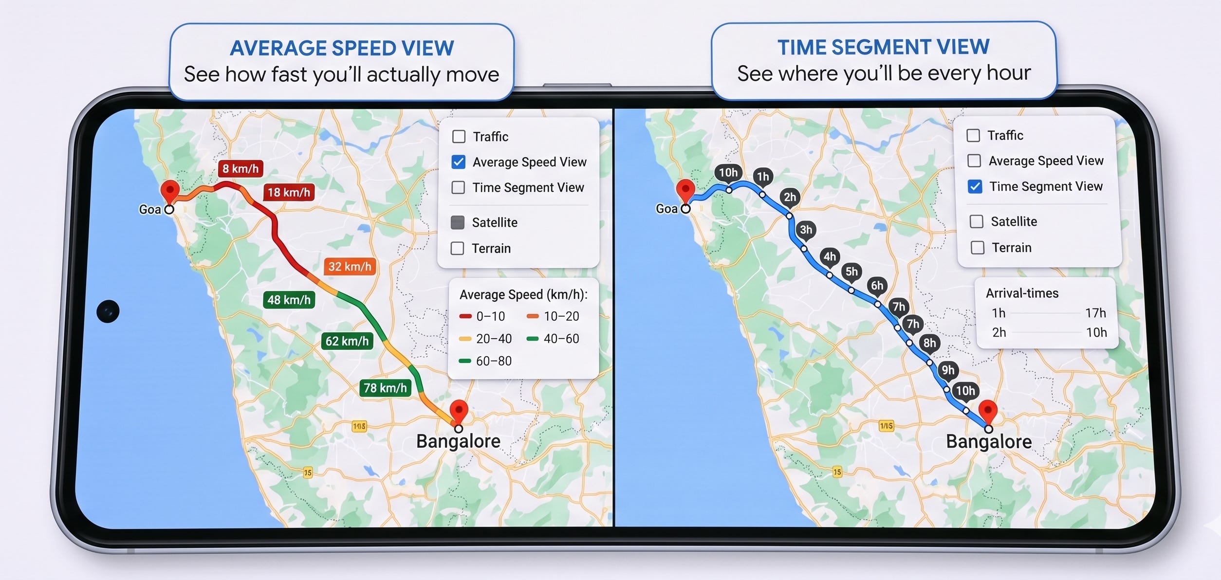
1. Color by Average Speed (Not Just Traffic)
A new map layer: speed heatmaps
Today’s traffic colors (blue / orange / red) tell you congestion.
But congestion is not the same as actual movement.
Two roads may both be “red”, but on one you crawl at 6 km/h and on the other you still manage 35 km/h.
That difference matters.
The missing toggle
“Color route by average speed per segment.”
Instead of vague traffic density, Maps would show precise movement patterns:
0–10 km/h → dark red (near gridlock)
10–30 km/h → orange
30–60 km/h → yellow
60+ km/h → green/blue (free-flowing)
Two modes:
A) Live Average Speed
Based on what cars are actually doing right now.
B) Historical Average Speed
Based on time-of-day + day-of-week patterns
(“Fridays at 6 pm”, “early morning on weekdays”, etc.)
This turns your route into a speed heatmap, not just a traffic mood ring.
You immediately know:
Where you’ll crawl
Where you’ll cruise
Where you need alternate routes
Where to mentally prepare for pain
A tiny toggle.
A massive clarity upgrade.
2. Split Long Trips Into Time Segments
If Maps says 11 hours, show me those 11 hours.
If your drive is long, Maps currently shows it like a single monolithic journey.
But planning a long trip is actually about understanding time.
You want answers to simple questions:
“Where will I be after 2 hours?”
“What’s the half-way town?”
“Where will sunset hit me?”
“Where do I plan fuel, food, and breaks?”
Today, you do all this manually, mentally approximating based on the blue line.
That shouldn’t be necessary.
The missing toggle
“Split route into hourly segments.”
If the trip takes 11 hours, Maps would auto-split your path into:
Hour 1 → Hour 2 → … → Hour 11
Like chapters of a journey.
Each with a small label:
1h
2h
3h
…
11h
Even better: show ETA at each marker.
“ETA here: 10:40 am”
“ETA here: 12:05 pm”
“ETA here: 3:20 pm”
Dynamic too — if traffic improves or worsens, the hour-markers shift automatically.
What this gives drivers
Instant clarity on break planning
Much better night driving decisions
A real sense of progress on long drives
Better coordination with co-travelers
Realistic expectations for families with kids, elderly, or pets
This is the kind of feature that feels obvious in hindsight.
From Routes to Journeys
Both features rely entirely on data Google already has:
Speed telemetry
Historical traffic patterns
Route segmentation
ETA calculations
No new sensors.
No new hardware.
Just better organization and visualization.
These two toggles would transform long drives from:
“A single 11-hour blob”
to
“A clear, time-aware, speed-aware journey map.”
Google Maps changed how we navigate.
Now it’s time to change how we understand our movement through space and time.
If someone at Google sees this:
Build This Next.
I write about how products can be better — fixing what’s broken and imagining what’s missing.
If this made you notice something broken or missing, you can subscribe to Build This Next to receive future essays directly.
Every subscription is a vote for building better products.
And if this sparked an idea, take a few seconds to share it — it might help someone else build or see products differently.